T Villager Designs
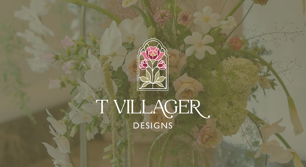
T Villager Designs is a floral design company based in Nashville specializing in floral arrangements for weddings and events. With a shift in ownership, they were looking for a brand refresh. As a reputable brand in the Nashville-area, they wanted to stay true to the original brand while adding some personality that reflected the new ownership. The direction was vintage, artisanal, eclectic. The final design landed in a stained glass motif, playing into their existing tagline "handcrafted love stories."
Responsibilities
Brand and Logo Design from concepts to final execution
Timeline
April 2026 - May 2026

Original Logo
Working with the client, we identified several areas for improvement from the existing logo. The green was a bit muted and felt grey. We also wanted to incorporate some secondary colors to liven it up. The icon is small in comparison to the wordmark. The hummingbird no longer aligned with the new ownership so we brainstormed some other icons. We originally played with the client's favorite flowers as an icon, but ultimately ended up with this stained glass motif. We also switched out the font for something that felt more feminine than the original. We wanted to stay true to the overall structure, but wanted to add a more artisanal flare.
The Refreshed Brand

Final Logo
Conducted two rounds of concepts. Playing into the existing tagline, "Handcrafted love stories," we created an icon that felt more artisanal and updated the font to something a little more feminine. We created a full brand system that could be used in a variety of applications.